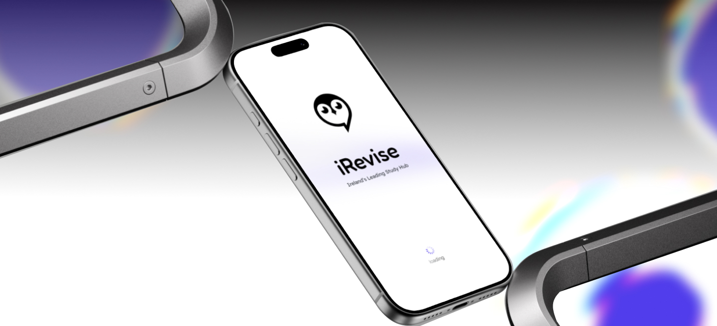
Simplifying Learning Through Better User Flow
Overview
iRevise is a digital learning platform that helps students prepare for exams through structured study materials, MCQ practice, exam creation, and past papers. Teachers can create assessments and learning resources, while parents can monitor learning progress.
The project originally began as a mobile application. As research progressed, stakeholder discussions and changing business goals shifted the direction toward a web application. This allowed the platform to support richer teacher workflows, better classroom management, and improved visibility for parents. As the UX/UI Designer, I led the end-to-end design process—from research and user flows to wireframes, UI design, interactive prototypes, and usability improvements.
Problem Statement
Although iRevise provided valuable learning resources,
The overall experience made it difficult for users to understand everything the platform offered.
Students gradually lost motivation after the trial period, teachers lacked classroom management tools, and parents had limited visibility into their child’s progress.
At the same time, navigation and content organization made discovering features more difficult than it needed to be.
Research
As any Designer would do rather than jumping directly into design, I first focused on understanding the business, existing user feedback, and competing products. Also the user feedback was provided to me by them.
Research Methods Include
Stakeholder discussions
Review analysis
Secondary research
Competitor analysis, The research naturally led to one important question:
"What makes a learning platform easy to use while still providing powerful tools?"
Competitive Analysis
I compared iRevise with Studyclix to understand how successful learning platforms organize content and guide users.
In Observation form my perspective, I found that
Studyclix uses a persistent sidebar that makes navigation simple
Subjects and learning resources are clearly categorized
Onboarding helps first-time users understand the platform
Many important features are immediately visible — though exposing that much at once creates clutter and cognitive load for new users
So, What I took forward
Keep navigation consistent on the left, so it feels familiar to users
Improve content organization so the most important things surface first
Reduce unnecessary cognitive load by splitting content into clear sections
Surface important features without overwhelming users
Insight
After synthesizing the research, several themes consistently appeared.
Teachers are the primary drivers of adoption. They need to feel comfortable recommending it to others
Students stay engaged when progress is visible and there's a sense of competition
Parents need evidence before committing to subscriptions, like a free 7-day trial for students
Better organization improves discoverability of the functions and content users need
Simpler navigation reduces frustration
Design Opportunities
Instead of adding features randomly, every solution was mapped back to a research finding. This ensured each feature solved a real problem and supported smoother navigation, rather than simply adding functionality.
UX Strategies
Before designing interfaces, I mapped the overall experience. The user flow helped me visualize how each user would navigate the platform, making it easier to identify key interactions and design a more intuitive experience.
Early Iteration
I prefer exploring ideas on paper before moving into Figma. Sketching lets me quickly test different layouts and organize content without getting distracted by visual details.
Based on stakeholder discussions, I skipped low-fidelity wireframes and started directly with mid-fidelity designs, focusing on structure using text and placeholder boxes instead of images. Once the layout was validated, I refined it into high-fidelity designs by adding visual hierarchy, colors, illustrations, and the iRevise mascot.
Starting with paper sketches made it faster to translate ideas into digital designs, iterate on layouts, and experiment with different solutions while saving time throughout the design process.
Final Solutions
Each feature directly responds to a research insight.
Prototype
This prototype showcases the final user experience, highlighting the primary user flows and the interactions that shaped the overall product.
Learnings
This project taught me,
Clear Communication is just as important in Designing
Even small misunderstandings can send a project in the wrong direction. Regular discussions, early feedback, and clarifying requirements helped keep everyone aligned and prevented unnecessary rework.
Adapting from mobile-first to web was the biggest challenge
It wasn't just about making screens larger, I had to rethink layouts, navigation, and user flows to suit desktop users while staying true to the original vision.
Balance between usability and creativity
I often enjoy making interfaces more visual and expressive, but I realized that adding too many decorative elements can distract from the experience. This project taught me to use creativity with intention, ensuring every design choice supports usability and the product's goals.